
第二十章、折角效果
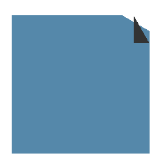
45度的折角
当折角为45deg时,实现原理是利用两层渐变背景,一层用来实现底层背景,一层用来实现折叠的三角,再把三角层覆盖在底层上,就形成了一个三角形的折角。
background: linear-gradient(to left bottom,transparent 50%,#333 50%) no-repeat right top / 20px 20px,
            linear-gradient(-135deg, transparent 14px,#58a 0);
// 底层透明为14px,这个值是三角大小的二分之根号二倍,通过勾股定理计算得出,三角中的20px是渐变的长和宽,背景渐变中14px的是对角线的长度,即三角形的高。
1
2
3
2
3

任意角度的折角
实现任意角度的折角,需要用渐变来实现背景,用伪元素来生成折角的部分。实现30deg的折角:
.a{
    background: linear-gradient(-150deg,transparent 20px,#58a 0);  // 20px为折角直角三角形的高
}
.a:before{
    content: "";
    position: absolute;
    top: 0;
    right: 0;
    width: 23px;  // 由三角函数可得长度为  20/cos 30°
    height: 40px; // 由三角函数可得高度为  20/sin 30°
    background: linear-gradient( to left bottom, transparent 50%,#333 0) right top no-repeat;
}
1
2
3
4
5
6
7
8
9
10
11
12
2
3
4
5
6
7
8
9
10
11
12
再对伪元素进行旋转,贴合渐变背景形成的折角边。
transform: rotate(-30deg);
transform-origin: bottom right; // 让旋转点固定为右下角,使得伪元素的位置可控性更高,这样伪元素右下角会贴合主元素边缘,这样伪元素就只要在高度这个方向上移动就可以贴合背景。
1
2
2

伪元素在高度上的位移可以通过之前一图计算出,要让伪元素的右下角贴合渐变背景的折角右顶点,上移的高度就等于伪元素的高减去宽。
transform: translateY(-17px) rotate(-30deg); // 先位移,再旋转,保证伪元素右下角的位置固定在右边缘
transform-origin: bottom right;
1
2
2

加上一定的修饰样式,让折角更加逼真。
.a{
    border-radius: 10px;
}
.a:before{
    border-bottom-left-radius: inherit; // 折角的圆角为左下角。
    box-shadow: -5px 5px 8px -3px rgba(0,0,0,.2);
}
1
2
3
4
5
6
7
2
3
4
5
6
7